LookAfter UX Case Studies
MobilApp Design
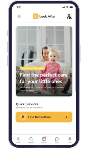
LookAfter
A complete overhaul of the baby-care ecosystem focusing on trust and sonic feedback loops. We redefined how users interact with care providers through rhythmic visual cues.
MOBIL Interface DesignUser Research Report:
LookAfter Ecosystem
Care Matching Ecosystem
7 Week Intensive
Mixed Methods Research
Verified
01 / Research Objectives
- Understand criteria for selecting care providers.
- Learn expectations from both parents and caregivers.
- Identify critical factors (security, price, references).
- Analyze competitors in the current market.
02 / Target Audience
Primary decision makers seeking high-trust care.
Service providers looking for reliable opportunities.
Secondary stakeholders within the family ecosystem.
03 / Research Methods
200 users, 15 categories
12 parents, 8 caregivers
3 individual sessions
5 major apps analyzed
04 / Timeline & Flow
05 / Key Findings Analysis
Parents Core Desires
Sitters Core Desires
User Definition & Journey

Goals
- Find a highly trustworthy sitter for her two daughters.
- Ensure maximum safety and reliability of providers.
- Experience a quick, friction-free booking process.
Pain Points
- Deep trust issues when leaving children with strangers.
- Severely limited time for administrative tasks.
- Concerns regarding payment security and transparency.
Emotional security is the priority for platform interactions.
Clear pricing and sitter bios build immediate trust.
Background checks as a non-negotiable requirement.
Journey Map: Sarah Jenkins booking Elena Gilbert
User Flow V1.4| Stage | Touchpoint | Emotion | Opportunity/Insight |
|---|---|---|---|
| 01. Awareness | App Store | Curious | Highlight trust and safety features in marketing. |
| 02. Exploration | Home Screen | Informed/Cautious | Build trust through visible badges and high-quality reviews. |
| 03. Evaluation | Profile Screen | Reassured | Feature parent testimonials prominently. |
| 04. Booking | Booking Calendar | Organized | Ensure flexible scheduling options for working parents. |
| 05. Payment | Payment Screen | Anxious/Relieved | Provide a clearly secure and transparent gateway. |
| 06. Confirmation | Confirmation Screen | Relieved | Provide a comprehensive and printable booking summary. |
| 07. Post-Booking | Push Email | Confident | Strengthen loyalty with easy chat and emergency options. |
Foundational Value
Values trust, transparency, and extreme simplicity in interaction.
Post-Mechanic
Verified profiles directly reduce anxiety during vetting loops.
UX Impact
A smooth, frictionless flow significantly increases conversion metrics.
Retention
Post-booking clarity maps directly onto long-term platform loyalty.
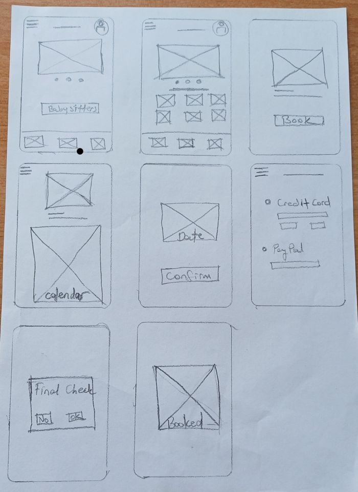
Starting to Sketch
Sketching is the first step in shaping an app idea. I quickly draw simple boxes, buttons, and flows on paper to visualize how users will move through the product. The goal is not polished visuals but clarity of structure — showing screens, navigation, and booking steps in a fast, low-cost way. These sketches help discuss, refine, and prepare for wireframes and prototypes.
Wireframing &
Prototyping
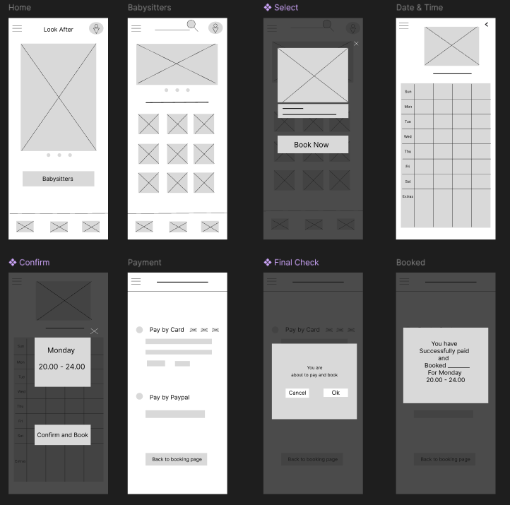
Wireframing is the step where ideas turn into structured layouts. Designers create simple, low-fidelity screens that outline navigation, content placement, and user flows without focusing on visuals. The purpose is to clarify functionality, test usability early, and provide a blueprint for prototypes and final design.
Usability Test Report - LookAfter App
🎯 Objective
Evaluate the clarity, efficiency, and user satisfaction of the booking flow from browsing babysitters to payment confirmation.
👥 Participants
6 parents (ages 25-45) with children under 10.
2 babysitter candidates testing from the caregiver side.
🚀 Key Findings
Users easily moved from Home > Babysitters > Select. Search bar and location tools were clear, but some wanted filters (price, rating).
Calendar layout was clear, but some had difficulty finding the price per hour. "Confirm and Book" button was clear and reassuring.
✔️ Conclusion
Overall, the booking flow was intuitive and efficient, with strong clarity in confirmation and payment steps. Minor adjustments in calendar design, filtering, and post-booking communication would significantly improve usability and user confidence.
High Fidelity Mockups
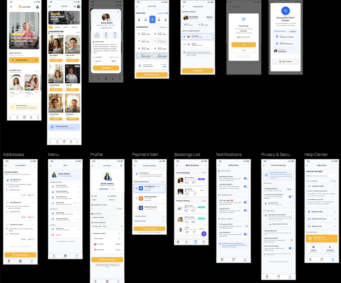
Visualizing The Prototype
See the babysitter booking flow in action. The prototype video showcases the complete journey — from browsing trusted caregivers to selecting dates, confirming details, and making secure payments. Designed for clarity and ease, the mockup demonstrates how parents can arrange childcare in just a few simple steps.
LookAfter Global
2024