LookAfter UX Case Studies
WebApp Design
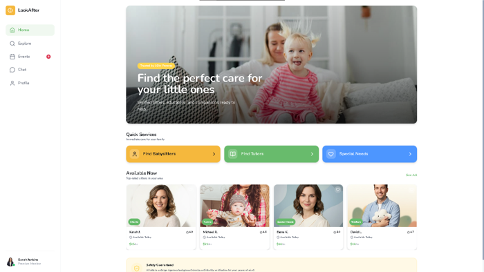
LookAfter
A complete overhaul of the baby care ecosystem focusing on trust and sonic feedback loops. We redefined how users interact with care providers through rhythmic visual cues.
User Research Report:
LookAfter Web App
Care Matching Web App
Q1 2024
Web Interface Analysis
Verified
01/ Research Objectives
- Understand desktop user interactions for payment and transaction security.
- Evaluate address management and location-based filtering logic.
- Test booking flow efficiency and clarity of calendar constraints.
02/ Target Audience
Primary: Parents
Friction-less booking interface for short-notice childcare.
Secondary: Babysitters
Individual caregivers managing schedules, payments, and safety protocols.
Administrative staff overseeing moderation, disputes, and regional platform scaling.

03/ Research Methodology
We conducted qualitative usability testing with 12 participants representing the primary and secondary user cohorts.
04/ Key Findings & Observations
Users expect immediate confirmation after sending entry. Hesitation observed on redirect pages.
Manual typing of addresses had over 12% error rate in zip codes. Validation is required.
Live views for dates range misalignment. Users preferred visual time blocks.
FAQ search was underutilized; most participants instinctively looked for a live chat bubble.
Post-booking feedback loops are missing. Users wanted to rate sitters immediately.
Quantitative Metrics
05/ Tactical Recommendations
Replace "Service Units" with "Hours of Care" to align with user mental models.
Implement Google Maps Places API to eliminate manual entry errors.
Shift from list-based date selection to an interactive calendar grid.
Place an omnipresent chat anchor in the footer for instant dispute solutions.
User Definition & Journey

Goals
- Find a highly trustworthy sitter for her two daughters.
- Ensure maximum safety and reliability of providers.
- Experience a quick, friction-free booking process.
Pain Points
- Deep trust issues when leaving children with strangers.
- Severely limited time for administrative tasks.
- Concerns regarding payment security and transparency.
Emotional security is the priority for platform interactions.
Clear pricing and sitter bios build immediate trust.
Background checks as a non-negotiable requirement.
Journey Map: Sarah Jenkins booking Elena Gilbert
User Flow V1.4| Stage | Touchpoint | Emotion | Opportunity/Insight |
|---|---|---|---|
| 01. Awareness | App Store | Curious | Highlight trust and safety features in marketing. |
| 02. Exploration | Home Screen | Informed/Cautious | Build trust through visible badges and high-quality reviews. |
| 03. Evaluation | Profile Screen | Reassured | Feature parent testimonials prominently. |
| 04. Booking | Booking Calendar | Organized | Ensure flexible scheduling options for working parents. |
| 05. Payment | Payment Screen | Anxious/Relieved | Provide a clearly secure and transparent gateway. |
| 06. Confirmation | Confirmation Screen | Relieved | Provide a comprehensive and printable booking summary. |
| 07. Post-Booking | Push Email | Confident | Strengthen loyalty with easy chat and emergency options. |
Foundational Value
Values trust, transparency, and extreme simplicity in interaction.
Post-Mechanic
Verified profiles directly reduce anxiety during vetting loops.
UX Impact
A smooth, frictionless flow significantly increases conversion metrics.
Retention
Post-booking clarity maps directly onto long-term platform loyalty.
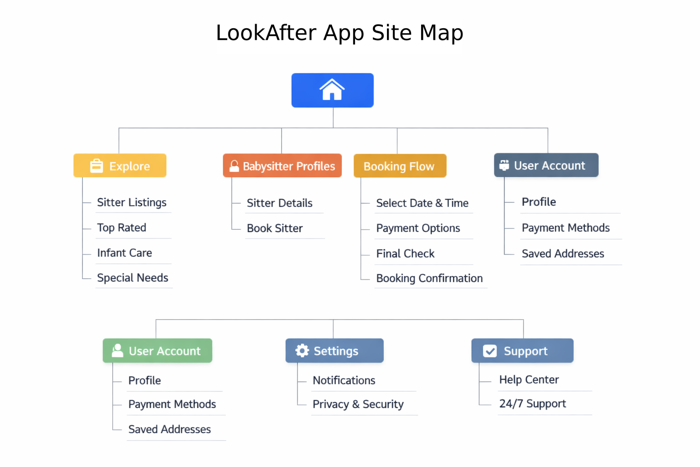
Information
Architecture
The website sitemap was created at the very beginning of the design process to define the overall information architecture. We mapped out the core sections—Home, Explorer, Babysitter Profiles, Booking Flow, User Accounts, Settings, and Support.
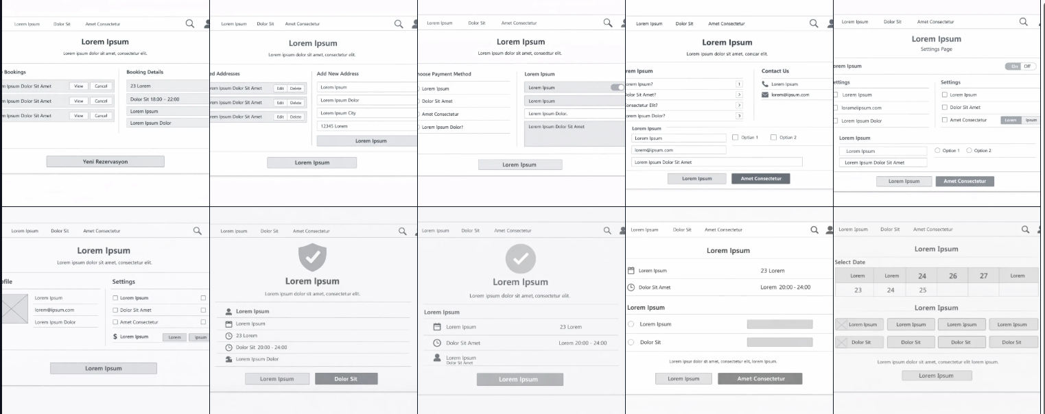
Wireframing &
Prototyping
The wireframes translated the sitemap into screen layouts. Each layout was low-fidelity, focusing completely on structural context, architecture maps, layout rules, and key user flows before rendering asset weights.
Usability Test Report LookAfter Web App
🎯 Objective
Assess how users interact with the desktop workflows of the babysitter platform, identify usability issues in payment, address management, booking, help, and feedback flows. Compare efficiency against expectations set by mobile version rules.
👥 Participants
12 users (8 parents, 4 babysitters). Age range: 25-52. All participants had prior experience with digital marketplace models.
✨ Key Findings
Edit/Delete buttons worked well; missing auto-complete slowed initial verification.
List view was functional, but users strongly preferred a granular calendar interface grid.
Clear safe action button worked, but legacy layout placeholder fields confused cohorts.
FAQ content was deep, but lack of direct live chat anchors slowed resolution times.
🚀 Recommendations
- • Replace placeholder labels with realistic structural processing details.
- • Map auto-complete parameters over complex local address layers.
- • Transition structural workflows directly into dynamic component calendars.
- • Embed localized communication channels directly inside universal layout views.
- • Enable complete configuration rules to pass unlinked payload data logs anonymously.
High Fidelity Mockups
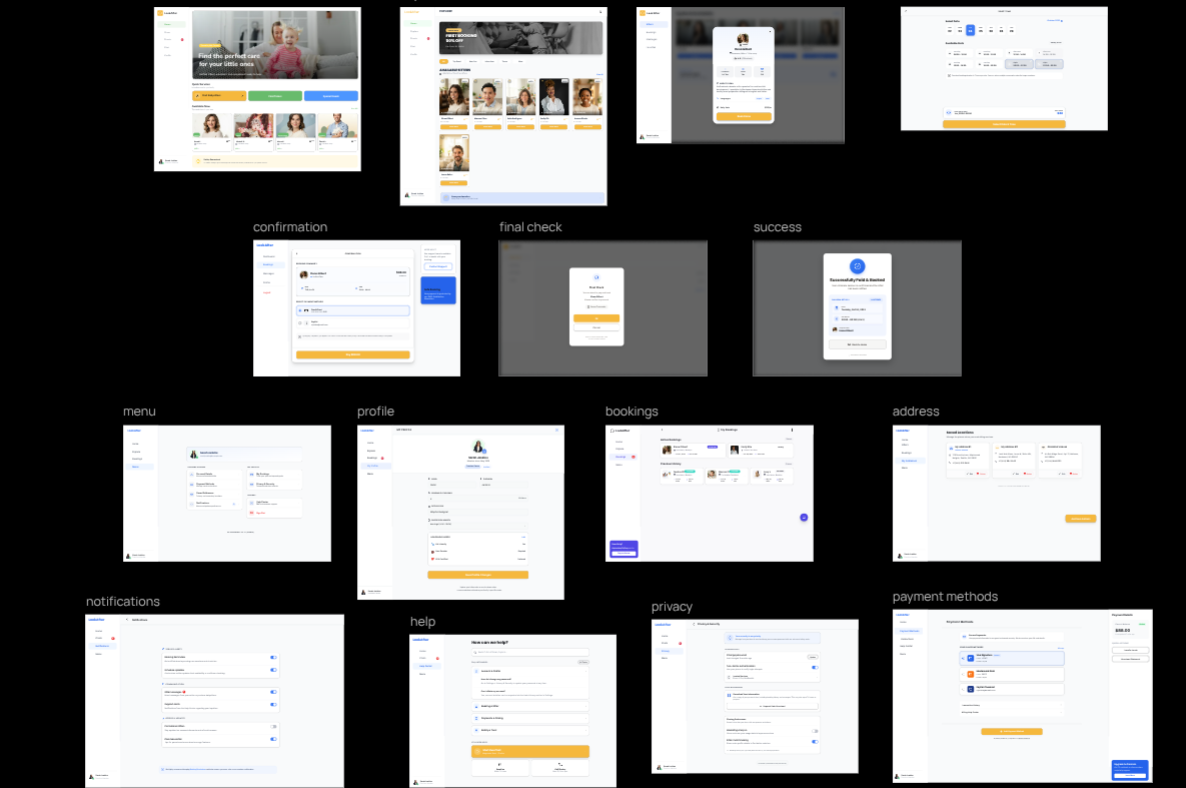 View High Quality
Visualizing The Prototype
See the babysitter booking flow in action. The prototype video showcases the complete journey—from browsing trusted caregivers to selecting dates, confirming details, and making secure payments. Designed for clarity and ease, this mockup demonstrates how parents can arrange childcare in just a few simple steps.
2024
Lead Product Designer
LookAfter Global